Hagertos Pro
Font Case Study
Studying the importance of legibility for
low vision impairments
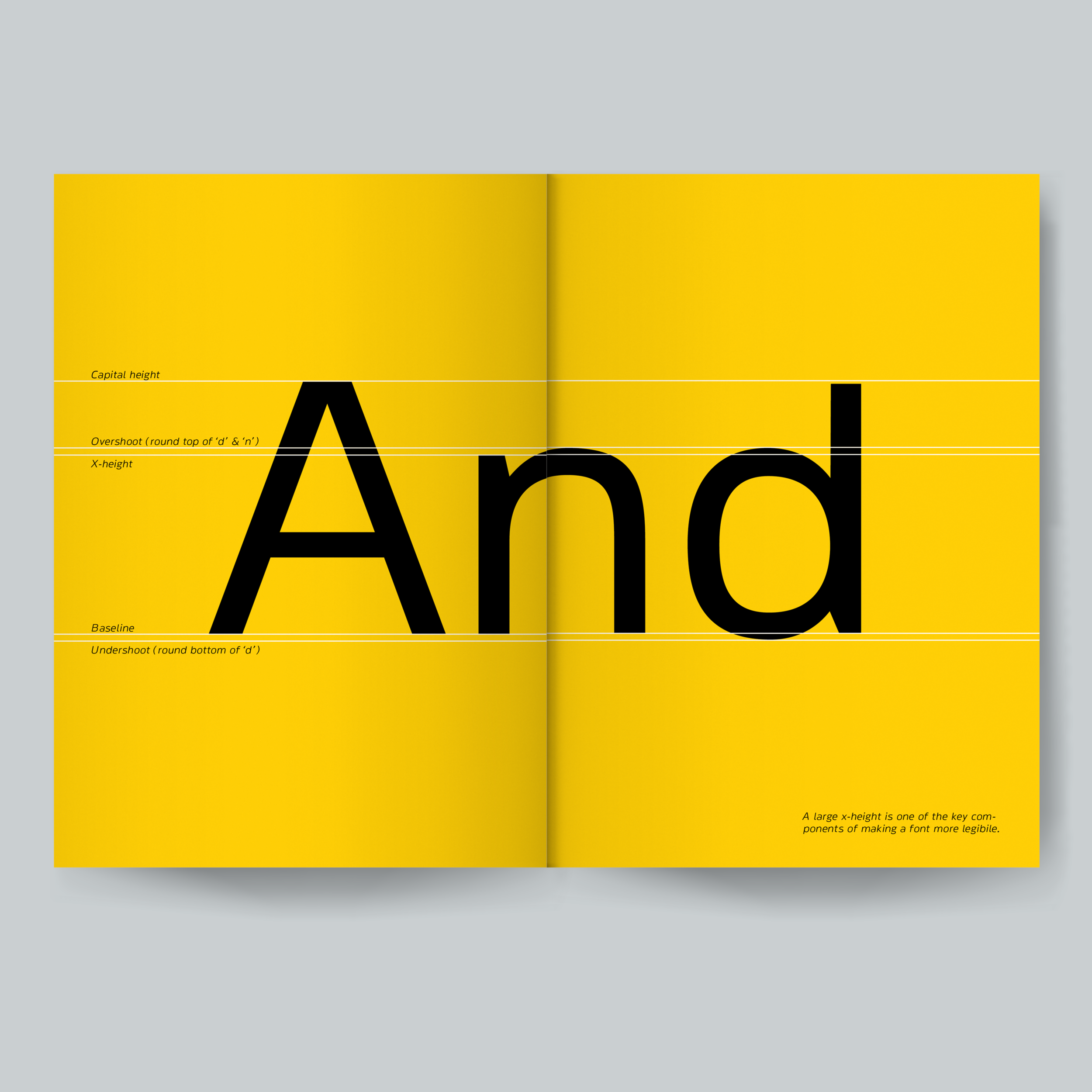
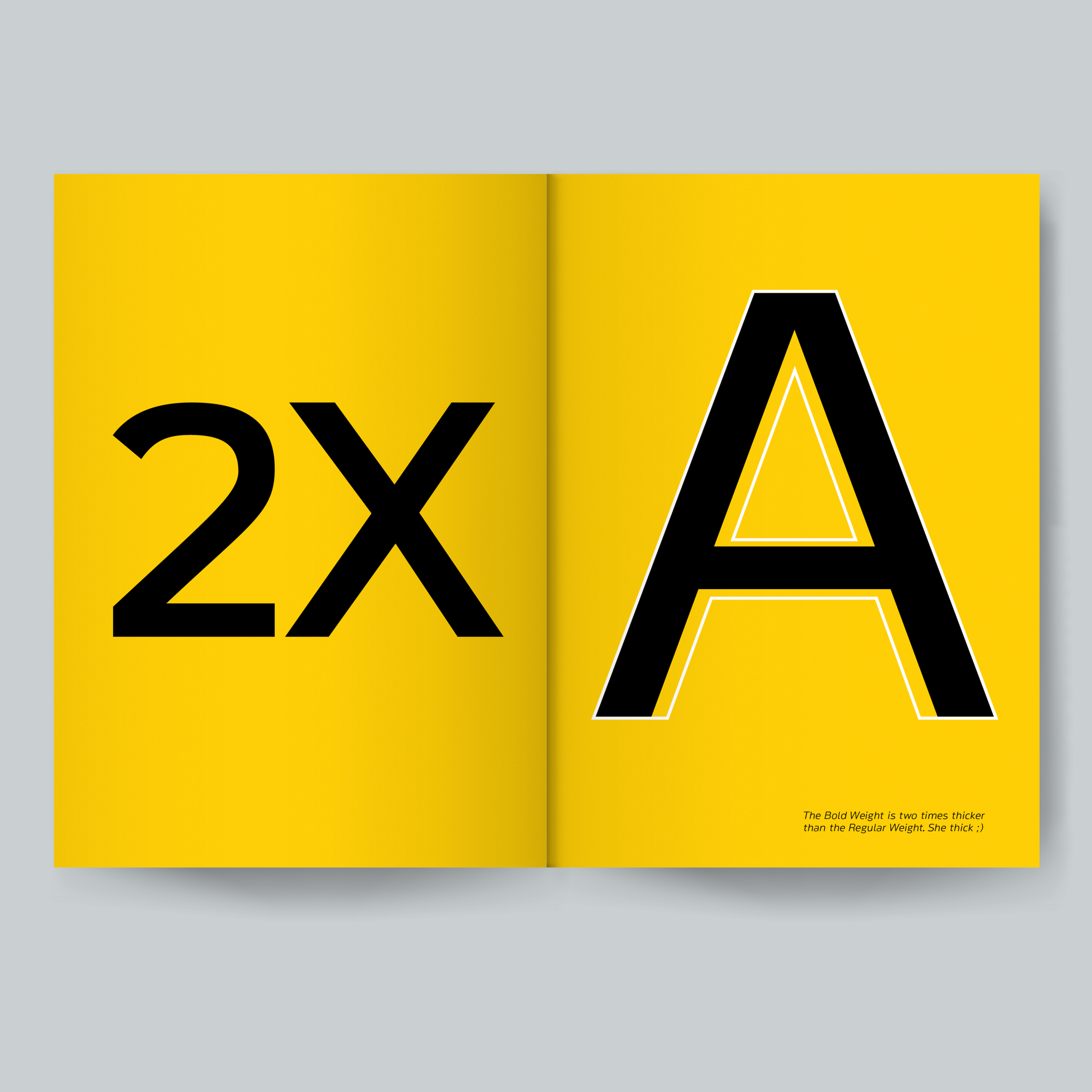
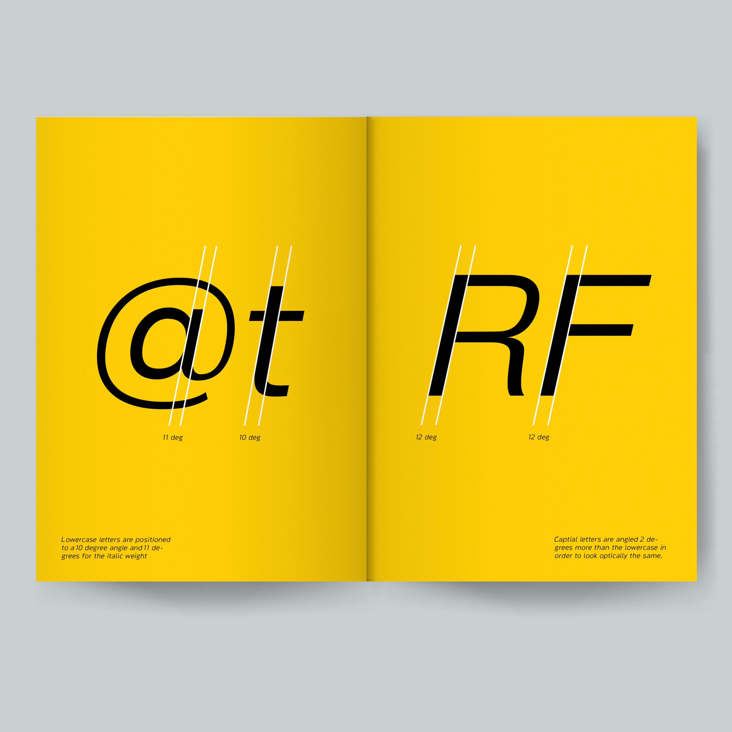
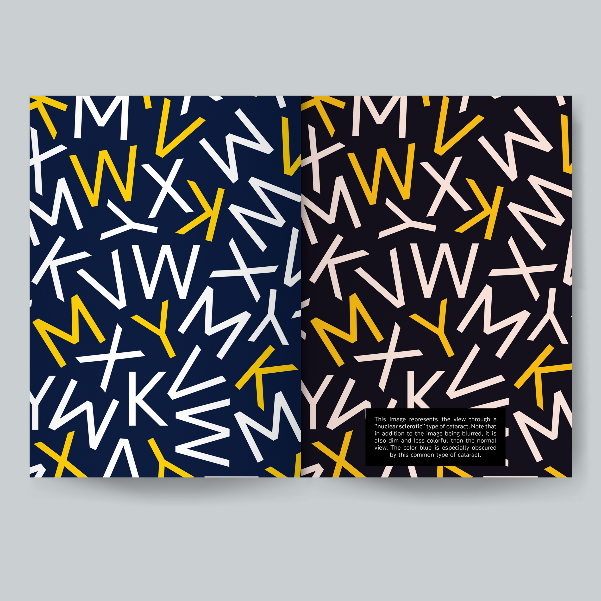
Research shows that there are 285 million people who have a visual impairment making it difficult for them to read the majority of published work that is made for people with normal eyesight. Respectively, this case study examines the importance of legibility by creating a typeface for impairments such as Astigmatism, Macular Degeneration, and Cataracts. The goal was to see how drastic a font's characteristics need to be to aid people with low vision impairments to differentiate between commonly confused letters (e.g. 'O', 'Q', 'D', 'C', 'G' — 'e', 'c', 'a', 's', 'n', 'u', 'o' — 'V', 'Y', 'W', 'M', 'K', 'X').


Commonly Confused Letters 'O', 'Q', 'D', 'C', 'G'

Commonly Confused Letters 'e', 'c', 'a', 's', 'n', 'u', 'o'

Commonly Confused Letters 'V', 'Y', 'W', 'M', 'K', 'X'


Normal

Severe “wet” Macular Degeneration

Normal

Astigmatism

Normal

“Nuclear Sclerotic” Type of Cataract

Hagertos Pro Research and Development Book


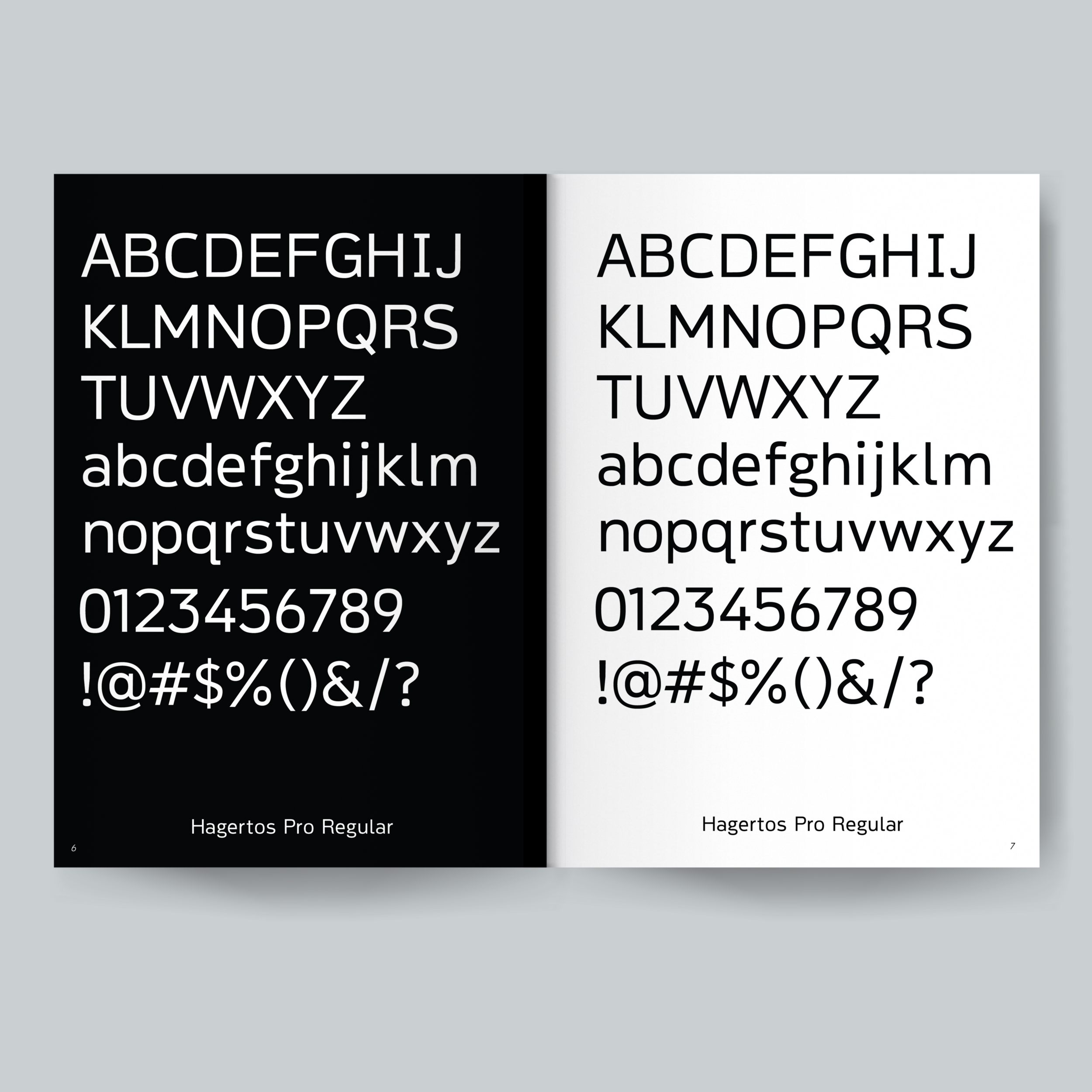
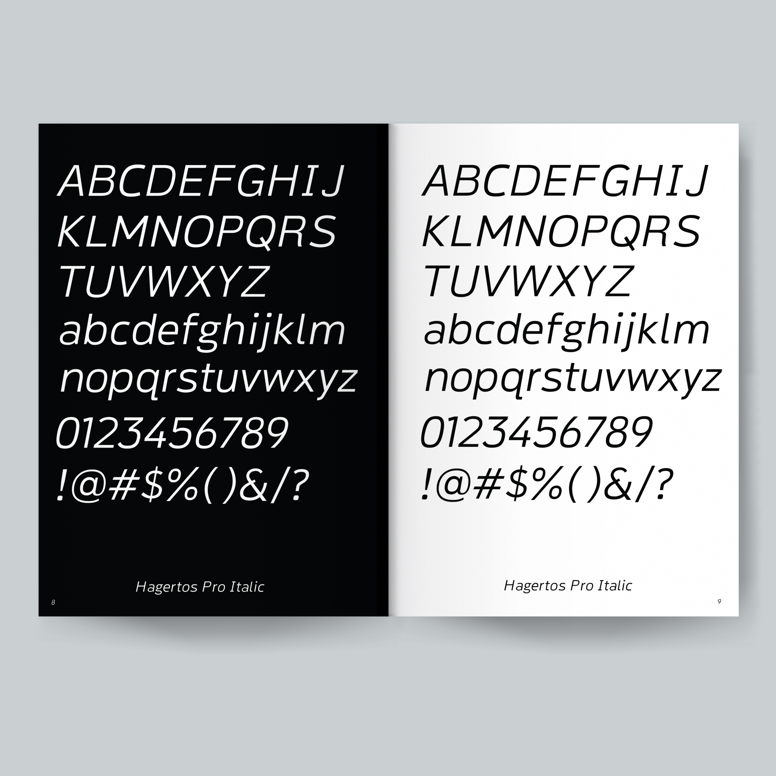


Hagertos pro Type Specimen